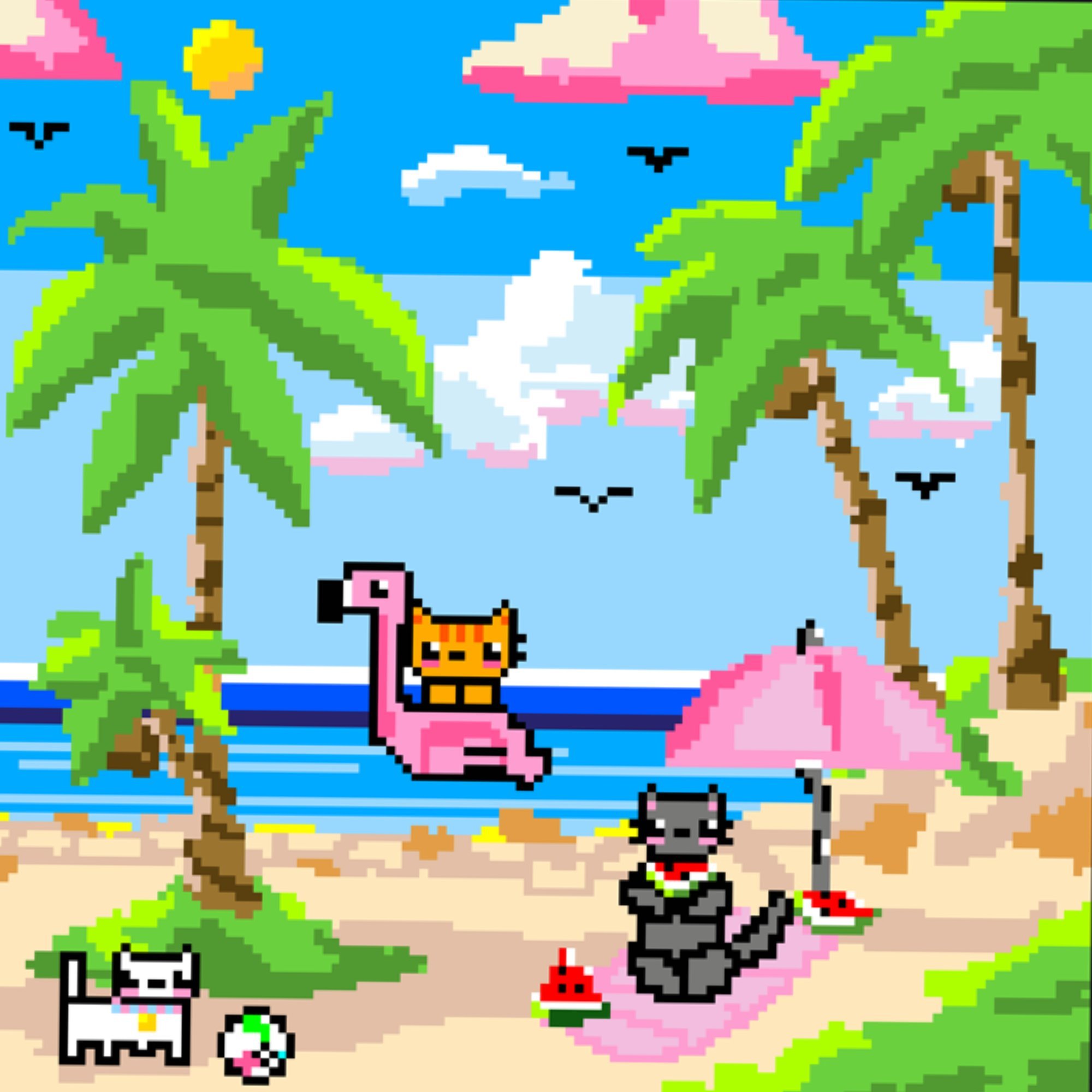
Q1: What specific childhood beach memory or summer experience inspired the story behind meowmories of a fun beach day?
A1: Growing up in a small town in Kuching, Malaysia, I have always associated Kuching with cats, since it is famously known as the “Cat City.” When I thought about the feeling of a fun beach day and the kind of memories I had from growing up, I wanted to combine those two ideas into one scene. Rather than recreating one specific beach or memory, I wanted the artwork to capture the overall feeling of being young, carefree, and spending a happy summer day by the water. That is where the idea of putting cats on a beach came from. I felt that using cats as the characters made the memory more personal to me and connected the artwork back to where I grew up.
Q2: The cats in your artwork bring so much life and personality to the scene—how did you decide on their designs, expressions, and activities?
A2: Honestly, most of the cats came to me naturally while I was drawing. I didn't have every character planned out beforehand because I wanted the artwork to feel spontaneous and playful. For example, when I was drawing the grey cat, I pictured grey as a more serious colour so instead of playing with a beach ball or in the water with a cute floaty I pictured him as someone who is more likely to chill by the beach enjoying his watermelon. I think that spontaneity is part of what makes the artwork feel lively, because the characters weren't designed to be perfect, they were allowed to simply have fun and so was I while I was drawing!
Q3: You created this piece using pixel art on the Divoom app. What drew you to this medium, and what unique possibilities or challenges did the app present for this project?
A3: Divoom is an app that specialises in helping artists create pixel art, so it made the process very accessible and enjoyable for me. One of the challenges was learning to embrace that limitation. Normally, when drawing, you might want to blend colours or smooth out your lines, but pixel art doesn't really work that way. Instead of constantly trying to fix those imperfections, I learned to use them as part of the style. I think that actually helped the artwork because the strong contrasts and blocky shapes contributed to the playful, nostalgic feeling I wanted the piece to have.
Q4: The bright, tropical colors immediately evoke a feeling of summer warmth. How did you approach selecting and balancing your color palette to capture that sense of nostalgia?
A4: I chose bright and tropical colours because they reminded me of the energy and happiness associated with being at the beach. Bright blue skies and water, warm sandy colours, and pops of colour throughout the characters and objects, just to add that bit of whimsy and fun. For me, the colours were also an important part of creating nostalgia. Rather than trying to recreate a realistic beach, I wanted to exaggerate the colours slightly so the scene would feel almost like a colourful memory from childhood and a retro video game.
Q5: From the flamingo floatie to the watermelon slices, there are many charming details scattered throughout. How did you choose which retro and summer elements to include?
A5: I mostly thought about the things that would make me happy on a summer day. I wanted the artwork to include objects that people could immediately associate with having fun at the beach, things like colourful floaties, watermelon slices, bright decorations, and little playful details. The flamingo floatie, for example, adds a playful and almost retro feeling to the scene, while the watermelon slices bring in that refreshing feeling you associate with a hot summer day. Rather than choosing every detail because it had a specific meaning, I chose things based on the feeling they created together. I wanted viewers to look at the artwork and feel like they had been transported into a fun summer memory of their own.